Summary
This document is designed to assist you with programming and graphic collection to achieve the best possible visual and operational kiosk for your business.
The following pages provide information on the various components, their configuration options and the specifications for required graphics.
A checklist for you to detail your desired configuration options is provided at the end of this document for completion and return (Addendum A).
This content is available for download in editable .pdf format so that you can complete and return the checklist.
Contents
The Kiosk Menu
Product Images
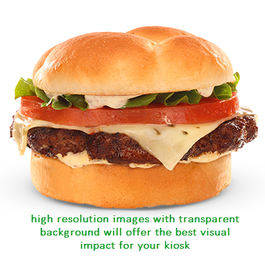 The image displayed for each menu item in Polygon Kiosk is configured in your Polygon POS Management database utilising the Polygon Customer Ordering architecture.
Image Dimensions
For maximum visual impact we suggest high quality images. Resolution should be at least
512px * 512px.
These should each be somewhere between 0.3MB - 0.5MB in size.
Image Background
Images should be *.png files with transparent backgrounds.
Product Sizes
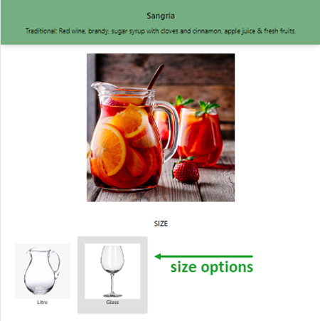
Polygon Kiosk supports menu items with multiple sizes if required. That is, the customer will choose the product, and then be presented with the choice of size.
Size Description
Ensure when programming the PLUs in the Polygon POS Management that each size of product is given a unique size description. This is the text in the square brackets as part of the Item Display Name as shown below. 
Default Size
The default size of a multi-size product is whichever PLU is added to the keypad. For example, if your range of drinks is available in sizes Small, Medium and Large, and medium is to be the default the PLU for the medium drinks will be those included on the keypad – customers will then choose to change to either the small or large variant as desired when ordering the item.
Upsells
You can mark one or more keypads as Upsell in the BOH. These will be combined into one list of upsell products, which can be shown in a special panel at the bottom of the Home screen, the Order Summary screen (or both).

Categories
Your products (PLUs) in the kiosk are arranged into categories. The same product can appear in multiple categories at the same time if desired. Each category in the kiosk relates to a designated web ordering keypad in the Polygon POS Management BOH database and the PLUs included on these keypads will be displayed in the kiosk.

Nesting
The kiosk supports two different degrees of category nesting.
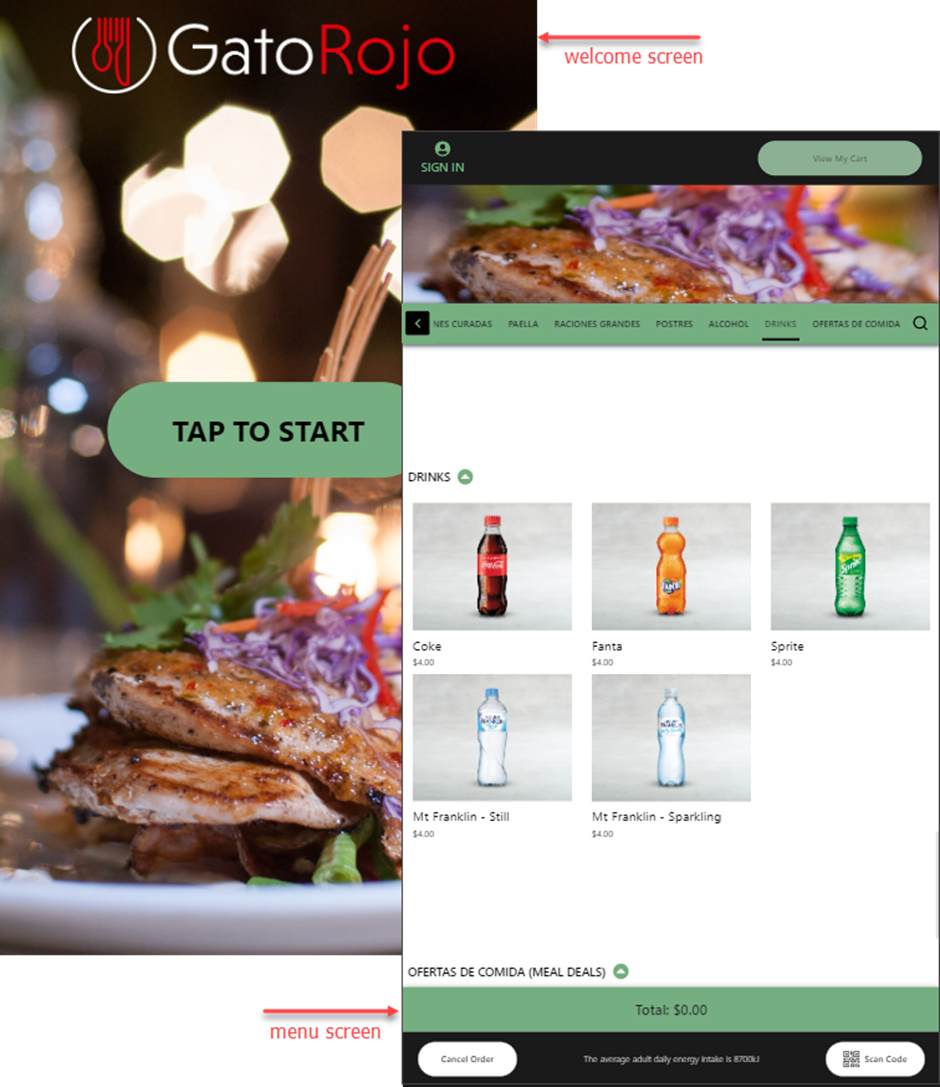
Flat (Standard)
In this mode there is no nesting beyond the first layer. The Welcome screen will progress directly to the Menu screen for the customer to order. That is, the Menu screen will encompass all Categories available.
In the example below, after the Welcome screen the Menu screen offers the Categories of Tapas, Ensaladas (Salads), Carnes Curadas (Cured Meats), Paella, Raciones Grandes (Main Meals), Postres (Desserts), Alcohol etc .
Nested (with Home Screen)
In Nested mode you can the ability to insert a Home screen between the Welcome screen and the Menu screen.
The Home screen is designed to display two (2) options that allow you to separate your menu into two distinct groups.
In the example below, the Welcome screen progresses to the Home screen which offers the choice of Share Menu, or Mains & Desserts. The Mains & Desserts option then only offers the categories of Mains (Raciones Grandes) and Desserts (Postres).

Category Naming
For maximum visual impact, it is recommended that your Category names be kept as short as possible. Ideally, they should be just one or two (shorter) words.
Category Images
You may choose to have images associated with your Categories which are then displayed on the Category Navigator bar in the Menu screen.

If you are using the Home screen, images are a requirement for the Categories chosen for this layer.

Image Dimensions
We suggest high quality images, at least:
Home screen 540px * 540px
Category Navigator buttons 100px * 100px
Image Background
Images should be *.png files with transparent backgrounds.
Ensure your images will look good against the background they will be placed on. The Home screen will almost always have a white background, but the category navigator bar on the Menu screen might not.
Promotional Images
The kiosk can display promotional images (advertisements and instructions).
It can show different images on different screens, as well as cycle through multiple images and restrict which images will be shown in several ways.
We suggest high quality promotional images be used.
Filetypes
The following formats are supported:
- WEBP - typically smaller files, reduce network traffic and load faster
- PNG - standard images
- GIF - animated images, typically much larger files
Welcome Screen
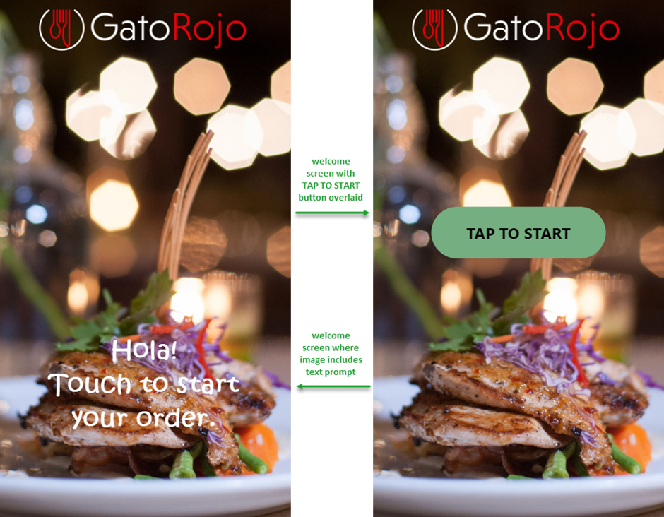
The Welcome screen is the default resting or idle screen of the kiosk.
You may choose to incorporate text on your welcome screen image along the lines of Tap to order, Touch here to start, or Start.
In our experience, users almost always press this text when starting an order, and without it they are unsure if the kiosk takes orders or is simply a non-interactive promotional display.
To this end, the Welcome screen has two modes.
- With Tap to Start Button - a button is overlaid on your welcome screen image as shown below; or
- With Text Included in Image – no button is present and the image on your welcome screen includes text prompting the customer to touch the screen to start.
Welcome Screen Image Dimensions
1080px * 1920px (this will cover the entire display area).
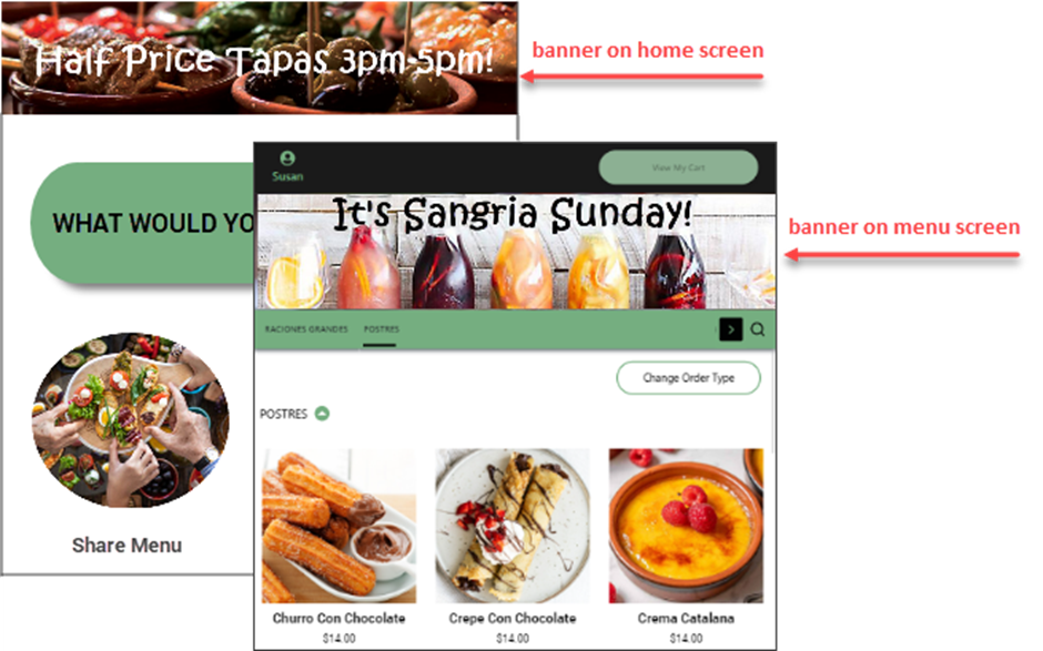
Promotional Banners
These promotional images are shown at the top of the Home/Login screen or Menu screen (or both).
Please ensure the image colours do not conflict with the surrounding UI. For example, the overall visual impact can be less than pleasing if the promotional banner images share the same colour as the category navigation bar.
Banner Image Dimensions
Home/Login screen 1080px * 320px
Menu screen 1080px * 240px
Display Duration
If you are using promotional banners on either the Home/Login screen or the Menu screen, more than one image can be enabled at the same time. When this is the case, the kiosk will cycle through the images.
Each image has a configurable number of minutes it will show for before the next image replaces it. If no duration is set, they will fall back to a default value of 5 minutes.
Display Restrictions
Images can be restricted via various rules to only show in some circumstances.
| POS Location | Only show for some locations. |
| Date Range | Only show within a given date range (e.g. only for this month and then stop). |
| Day of Week | Only show on some days of the week (e.g only Fridays, or just on the weekends). |
| Time of Day | Only show in a given time range (e.g. only during your breakfast hours). |
Brands
Brand Banners
If you are encompassing multiple brands in your kiosk, you may have a different banner assigned for each brand, and this will display on the menu screen when the brand is selected.

Brand Cards
Each brand can display a brand card or company logo. These will be used when the customer chooses an ordering brand. They will also show in the Also Order From bar at the bottom of the kiosk.

Brand Image Dimensions
Brand banners 1080px * 240px
Brand cards 640px * 360px
Supported file types for brand cards: jpg, png, webp.
Unavailable Screen
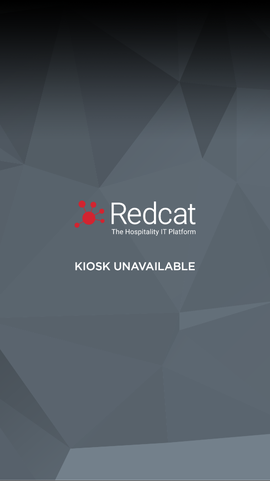
If for any reason the kiosk becomes non-operational (for example, loss of internet connection, or peripheral hardware failure) staff in store are able to place the kiosk into Unavailable mode.
You will need to provide an image that will be displayed in this circumstance.
Unavailable Screen Image Dimensions
Unavailable screen 1080px * 1920px
Category Navigator Bar
The Category Navigator bar (list of categories) on the Menu screen can be shown either across the top (but below any promotional banners), or down the left hand side of the screen.

Kiosk Sync Interval
The kiosk will periodically sync with your server to ensure it has the latest menu, promotional images and configuration. The sync interval is configurable, and defaults to 30 minutes.
Payment Methods
The kiosk supports several methods of payment. Payment methods may be enabled or disabled as required.
Payment methods include:
- Member Money,
- Member Points,
- Coupons,
- Eftpos (credit card and debit) via Tyro, and
- Gift Cards.
Theming
Many elements of the kiosk interface can be themed to better match your branding. There are some limits to what can be changed, so any requests will need to be discussed.
Fonts
For most text the Weight, Size, Letterspacing, Colour and Family can be specified. Please note that the styles of some pieces of text are linked together.
Custom Font Family Licensing
If you wish to use one or more custom font families on the kiosk, you must be licensed to do so.
You will need to complete the Statement of License Coverage included with this document (Addendum B) to Redcat before any custom fonts can be used.
Colours
Many elements, graphics, buttons etc. can have their colour changed to bring them in line with your branding. Care should be taken to preserve sufficient foreground-background contrast ratios for accessibility and general ease of reading.
To avoid confusing your users, it is typically a good idea to avoid styling elements in a way that goes against conventions. For example, you should not choose to have a success message coloured red, or a cancel button displayed in green.
Backgrounds
The background colour of most screens should be white, or very near to it. We do not advise using other colours.
Border Radius (Corner Roundness)
The roundness of buttons and some other elements can be configured.
Text Overrides
Almost every piece of text that appears on the kiosk can be customised, including messages that will be presented to the customer.
Sometimes care must be taken to ensure that replacement text meets minimum or maximum lengths.
Graphic Overrides
Almost every graphic (image, icon & loading spinner) that appears on the kiosk can be customised to a degree. Some care must be taken to ensure that replacement graphics are sized correctly and do not conflict with anything.
Addendum A - Configuration Checklist
Product Images
I understand my product images should be:
- 512px * 512px .png files with transparent background.
Size Images
If images for sizes are required, they should also be:
- 512px * 512px .png files with transparent background.
Upsells
I want to show Upsells on:
- Home screen
- Order Summary screen
Nesting
I want to:
- Include a Home screen (nested option)
- Do not include a Home screen (flat option)
Category Images
I want to:
- Include images on Category Navigator buttons
These files should be 100px * 100px .png files with transparent background. - Include a Home screen with two (2) category options
The image files for these should be 540px * 540px .png files with transparent background.
Welcome Screen
I will supply either:
- An image which contains prompt text encouraging my customers to start an order
This image should be 1080px * 1920px - An image to be used in conjunction with a Tap to Start button
This image should be 1080px * 1920px
These files may be: WEBP, PNG or GIF format.
Banners
If I choose to include Promotional Banners for:
- The Home/Login screen
These files should be 1080px * 320px - The Menu screen
These files should be 1080px * 240px - I will discuss duration and restriction requirements for Promotional Banners with my Redcat Contact and create a schedule for implementation if required.
Brands
If multiple brands are required, I will provide:
- A Banner image to be used on the Menu screen when each brand is selected
These files should be 1080px * 320px - A Brand Card image for each brand
These files should be 640px * 360px
Unavailable Screen
I will provide:
- An image to be used for the kiosk unavailable screen
This image should be 1080px * 1920px.
Category Navigator Bar
I would like the Category Navigator Bar located:
- Top, or
- Left
Kiosk Sync Interval
I want to:
- Use the default kiosk sync interval of 30 mins
- Change the kiosk sync interval to ……………. mins
Payment Methods
My kiosk should accept the following payment methods:
- Member Points
- Member Money
- Coupons
- Eftpos (Tyro only)
- Gift Cards
Theming, Text & Graphics Overrides
- I will discuss any desired theming, text and graphic overrides with my Redcat Contact.
Statement of License Coverage
I, …………………………, on behalf of ………………………………….....………….. confirm that
(insert your name) (insert your company/business name)
……………………………… are licensed to use the following fonts in the woff2 file format, and
(insert your company/business name)
for the instore self-serve kiosk use case. I also confirm that Redcat Pty Ltd is acting on behalf of
…………………………. in their use and handling of these fonts for the aforementioned purpose.
(insert your company/business name)
- ………………………………….....…………..
(insert custom font name) - ………………………………….....…………..
(insert custom font name) - ………………………………….....…………..
(insert custom font name) - ………………………………….....…………..
(insert custom font name) - ………………………………….....…………..
(insert custom font name)
Signed: ………………………………….....…………..
(insert your name)
Date: ………………………………….....…………......
(insert the date this document is signed)
Article Change Log
| Date | Record of Changes | Author |
|
February 2023 |
Updated for currency. Original article published 2109. |
S Black |
|
March 2025 |
Updated to include Login screen alongside Home screen (graphic specification for both is the same). |
S Black |